
Single KPI
Subsection devoted to timely analysis of the performance of individual KPIs.


The following applicable filters/selectors appear in the top bar to configure the analysis:
drop-down menu to select the KPI to be investigated;
drop-down menu to select an aggregation level (e.g., recipe, item, operator, the shift, etc.) to evaluate the impact of the aggregation factor on the KPI being analyzed. This allows, for example, to analyze the performance trend for each individual product, or for each individual shift;
zero filter. Considering that the "downtime" KPI is characterized by the presence of many zeros (e.g., as in the case of a machine going down rarely) by activating the "zero filter" option, the box plot on the left of the dashboard ignores all days (or time buckets in general) that have zero as their value. This makes the data distribution "clean" from the noise of zero days.


For each KPI, it is possible to display its trend over time in terms of point data or moving averages and in the form of a bar or line graph.
In traditional technical analysis, moving averages are algorithms for deriving a summary indicator of the trend of a value.
Mathematically, this indicator is an "average" of a given amount of data over time with respect to a "moving" time window, since it considers only the last 'N' detections in order of time.
The behavior of the selected KPI is described by a box plot graph that analyzes its distribution across instances of the aggregation level; while a line/bar graph shows the moving average of the KPI over time, broken down by aggregation parameter.
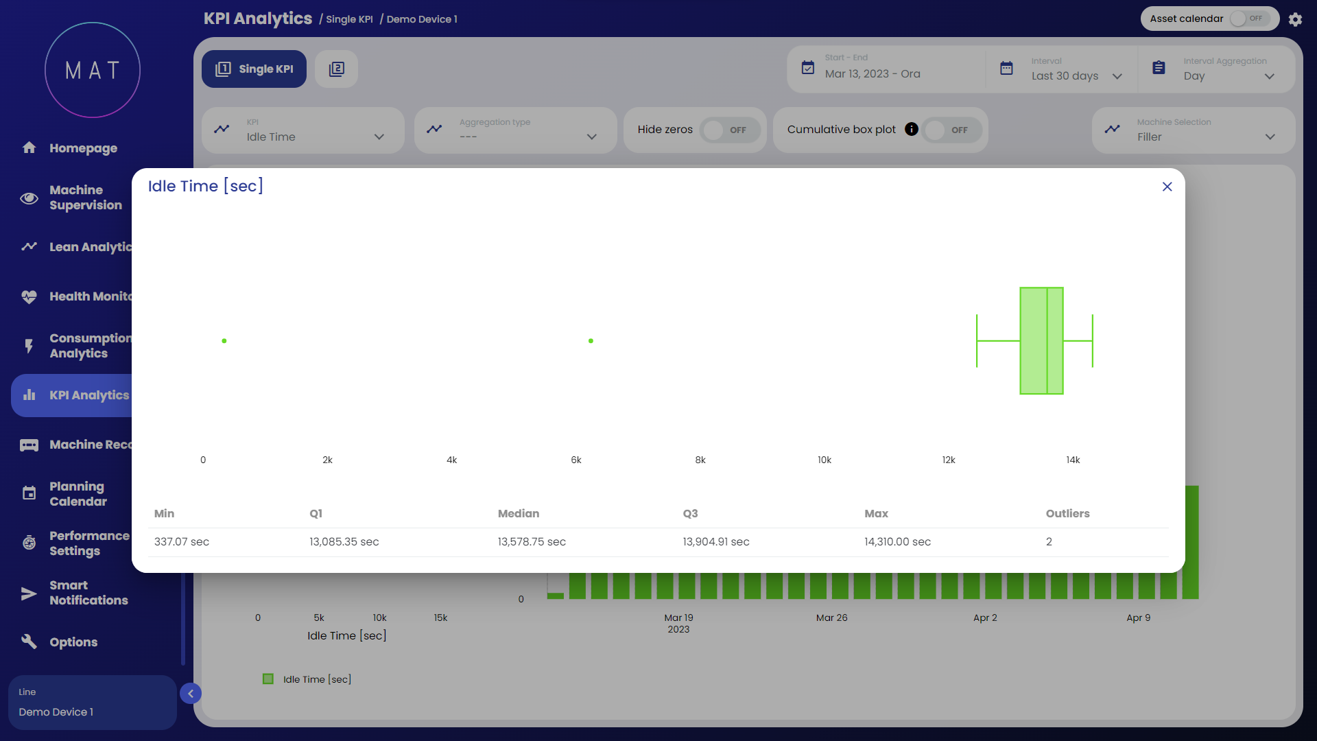
Here are the basic elements of a box plot:
the middle line in the box represents the median of the data. Half of the data is to the left of this value, the other half to the right. If the data are symmetrical, the median is in the center of the box. If, on the other hand, the data are asymmetrical, the median will be closer to the left or right side of the box;
the left and right sides of the box show the 1st and 3rd quartiles (Q1 and Q3). The length of the box is the difference between the two quartiles (IQR), contains 50% of the observations and shows the normal distribution of the data;
the two segments starting from the box and extending upward and downward are called "whiskers." The whiskers indicate the dispersion of values below the 1st quartile and above the 3rd quartile not classified as outliers;
isolated points outside the two segments represent outliers.
