
OEE Trend
This module is dedicated to the in-depth analysis of machine/line efficiency through the study of OEE and its components over time.
The top of the dashboard shows the percentage value of OEE and its components as well as other significant values, generally, productive time and downtime. This representation allows identification at the macro level of which component impacts productivity the most: this allows to focus on the most critical OEE component that needs attention.
Towards the bottom of the dashboard, you will find a graphical representation illustrating the evolution of Overall Equipment Efficiency (OEE) and its components over time. This visualization allows you to analyze the trend of OEE through either point data or moving averages.
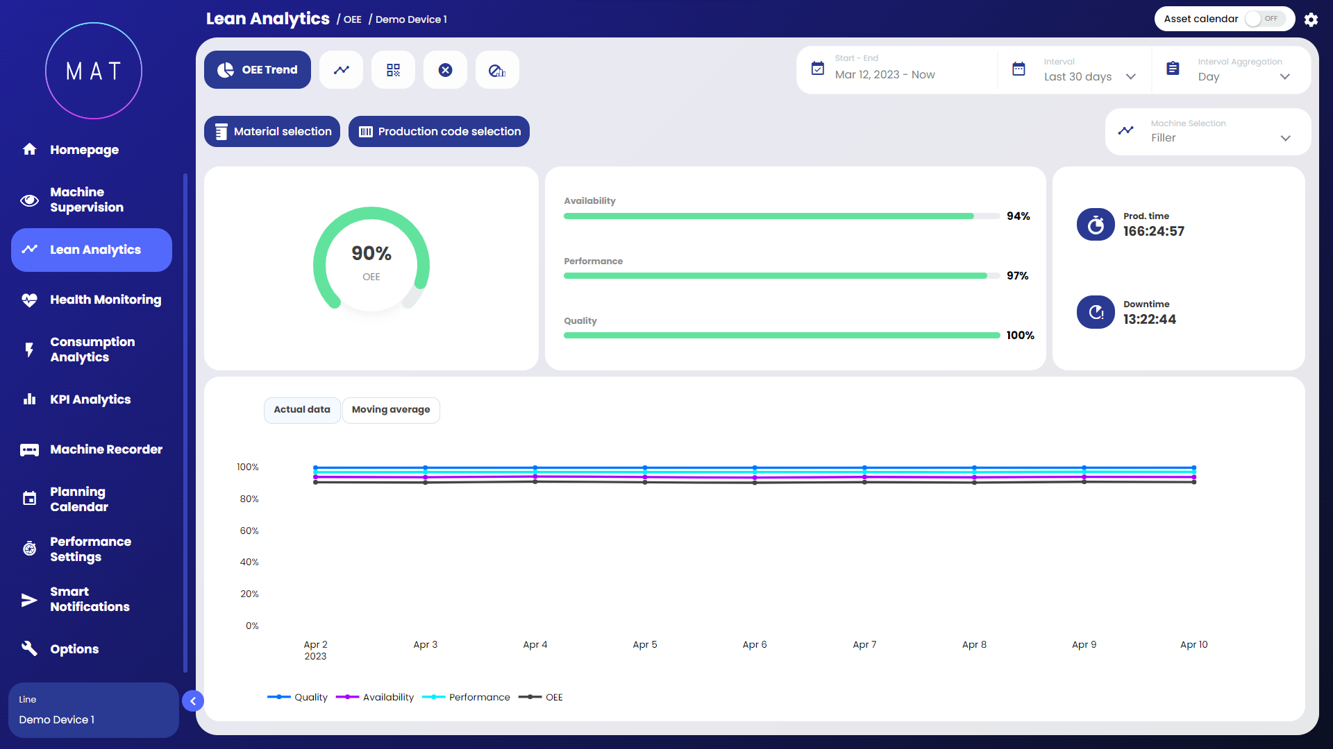

By selecting and deselecting components, OEE components can be isolated within the graph.
Interacting (zooming in) with the graph activates the "adaptive zoom" feature that contextualizes all the data displayed within the dashboard according to the selected time interval.
In traditional technical analysis, moving averages are algorithms for deriving a summary indicator of the trend of a value.
Mathematically, this indicator is an "average" of a given amount of data over time, with respect to a "moving" time window, since it considers only the last 'N' detections in order of time.


