
Scrap Analytics
Subsection dedicated to the analysis of waste causes over time.
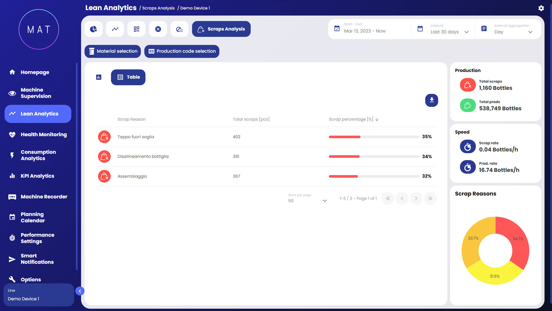
On the right side of the dashboard, there are widgets that display summarized information about the trend of non-conforming product pieces. Generally, the overall production KPIs and waste are compared to calculate the impact. Additionally, there is a pie chart for graphics displaying the impact of the waste causes with respective percentage values and over-info.
The waste-related information can be viewed in three different modes:
causes line chart: a chart where all waste causes are shown over time as lines of different colors. Each line represents the absolute count over time associated with the waste cause (one color/line per cause);

pareto chart: a pareto chart where each column represents a different waste cause (same logic as the Breakdowns module);
cumulative line chart: an area chart divided by waste causes, each cause has a different color.

Same informations are also displayed in a tabular format.
By default, the charts only display the top ten most relevant causes; the others are obscured in the legend.
The scrap analysis can handle various types of scrap. Assuming there are two categories of scrap called "primary scrap" and "secondary scrap," the graphical interface provides the option to separately display the screen dedicated to these two types of scrap. Transitioning from one to the other can be done using the dedicated toggle switch.

An additional feature of this page is available for those who have access to a system of cameras and sensors that capture real-time images of production. In fact, this section supports the display of images for all products that have been labeled as scrap.

The list of scrap images is located at the bottom of the page, and by selecting each image, you can view it in an enlarged format, with the option to zoom in further.
