Homepage
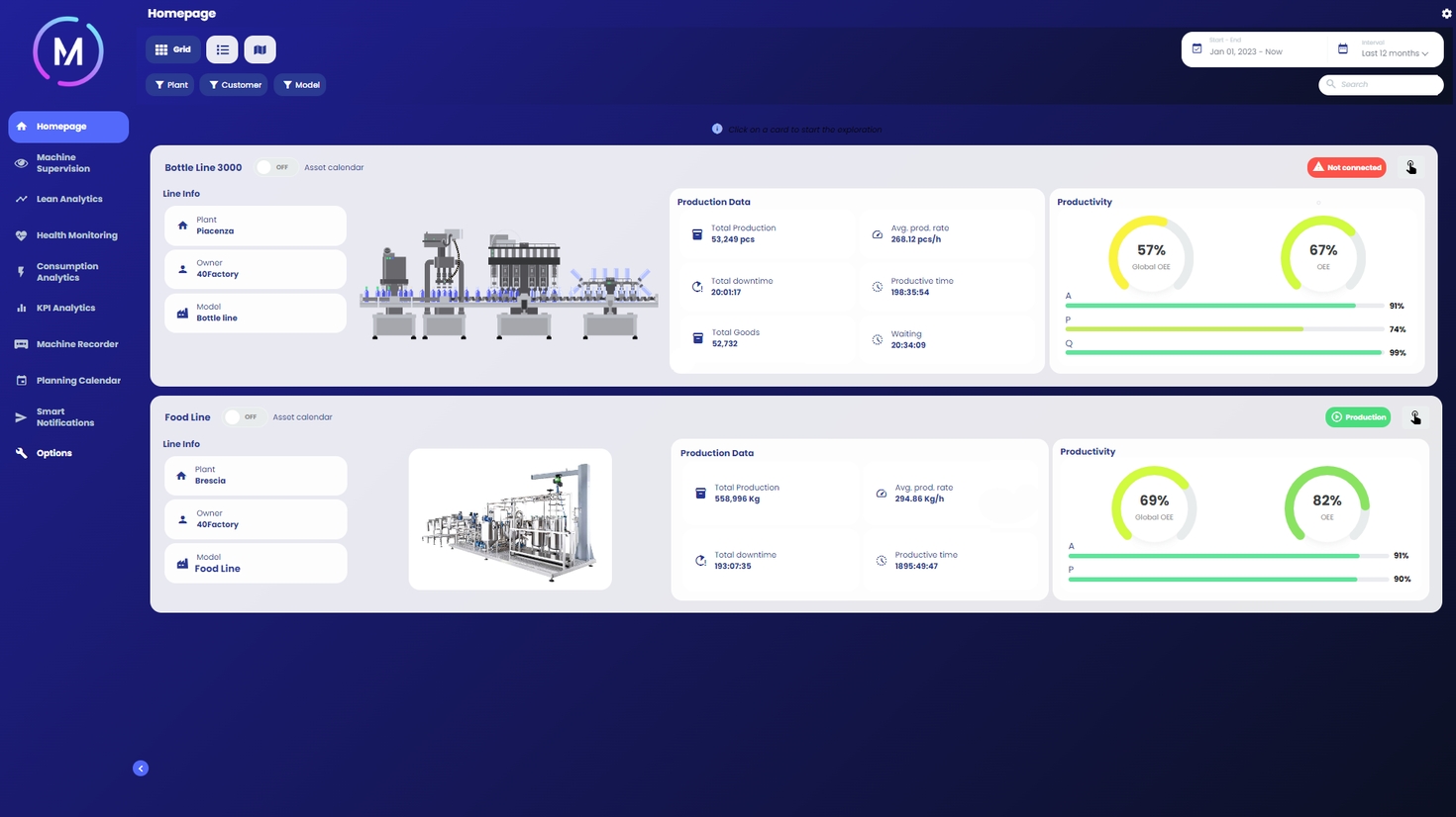
The web app homepage allows immediate visualization of the status of different connected machines/lines.


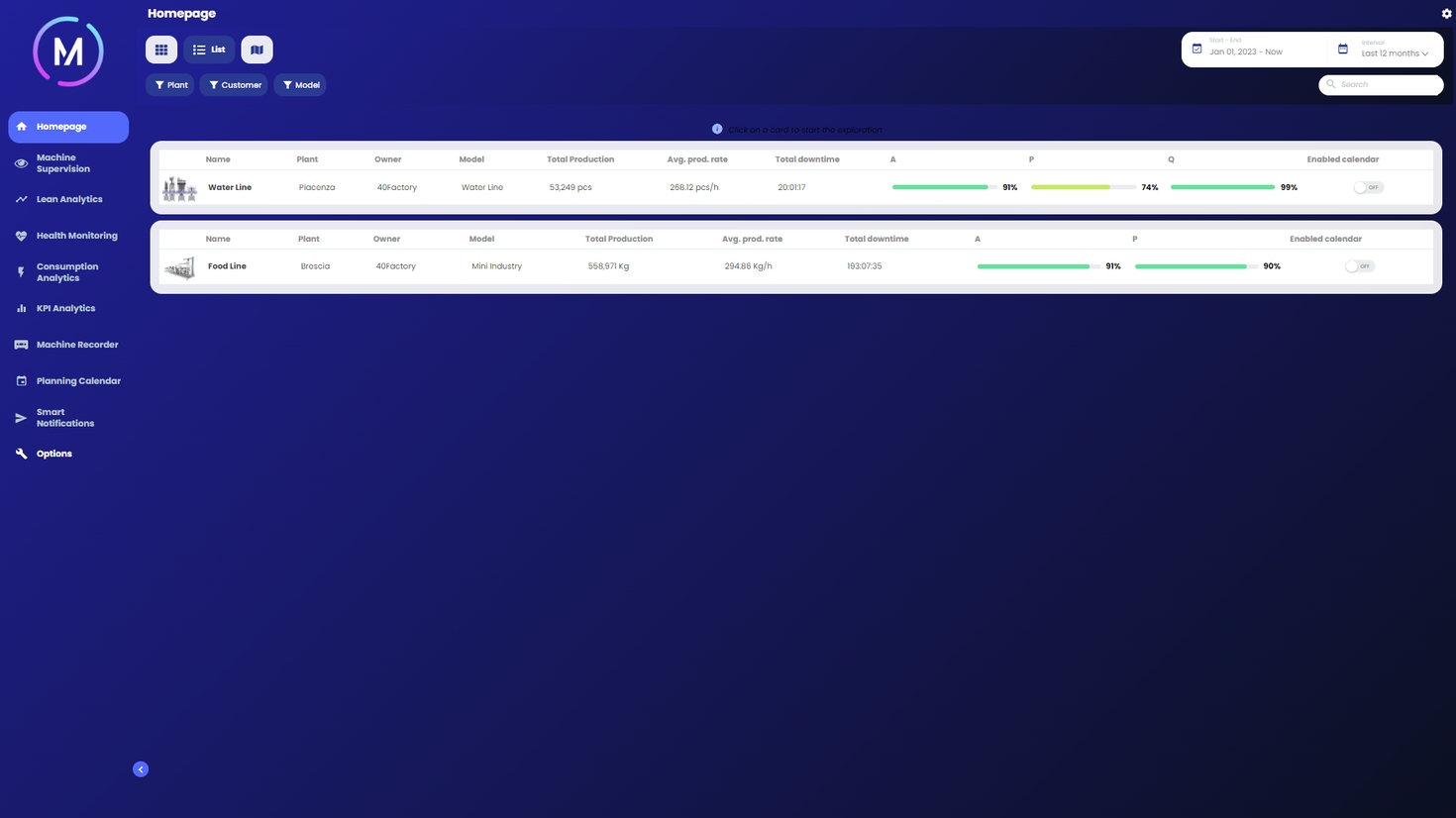
The page is divided into cards (one for each connected machine or plant), which summarizes the main information inherent to a specific machine/line (i.e., master data, value of OEE and its components), and other summary data related to the efficiency of the machine/line (i.e., operating time, production time, down-time, parts produced, waste quantities, energy coefficients, station health).
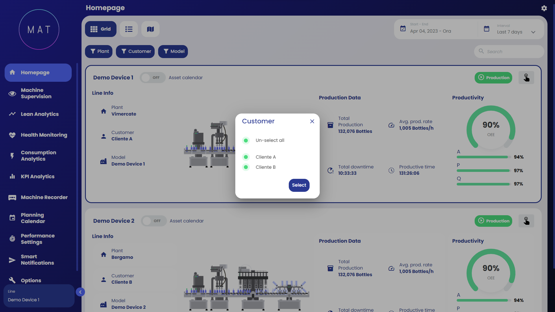
Users have the ability to customize the displayed data by performing the following actions:
Selecting a specific time period for analysis: By choosing a particular time frame, the summary information presented in the cards will automatically update accordingly. This feature enables quick access to a summary of machine/line behavior over a week, a month, or any desired time range.
Choosing the machine/line of interest: To select a specific machine or line, simply left-click on the corresponding card. This action unlocks access to the web app modules via the side MAIN MENU, which will be further elaborated below.

On the Homepage screen, for multi-machine lines, it is possible to display some KPIs related to individual sub-machines. Image A shows an example of a dashboard in the case of a line composed of eight sub-machines.

By selecting the finger-shaped icon located within each card in the top right, you can view, for each sub-machine, the timestamp corresponding to the last data update that occurred. The color of each element follows the conventions designed for machine states.

There are different ways to display the data on the Homepage: Grid, List, Map and Machines Connection Overview.