
Changeover Phases
In this section, it is possible to further analyze the trend of a selected KPI by focusing on interesting format changes. Specifically, you can focus on a series of selected format changes that result in the same final format.

At the top of the page, there are several controls to configure the analysis:
time interval: the data used for the analysis will be those related to the selected interval;
sub-machine: if the reference project is multi-machine, it is possible to choose the sub-machine on which to base the analysis;
filters: as in most MAT pages, filtering can be applied to exclude portions of data where certain conditions apply from the analysis;
phase: since a format change can consist of several phases, it is possible to apply the analysis to a single phase. Alternatively, the analysis can be applied to the entire format change, considered as a set of individual phases;
KPI for the analysis: the user is asked to select the KPI to be analyzed. These include: money lost/gained, time lost/gained, efficiency, average time, number of changes, time spent;
final format: the data used in the analysis will relate to format changes that meet certain conditions, i.e., those that have the specified final format and one of the initial formats selected in the corresponding control;
initial formats: this selector allows the selection of multiple initial formats. The data used in the analysis will relate to format changes that meet certain conditions, i.e., those that have one of the selected initial formats and the final format specified in the appropriate control.
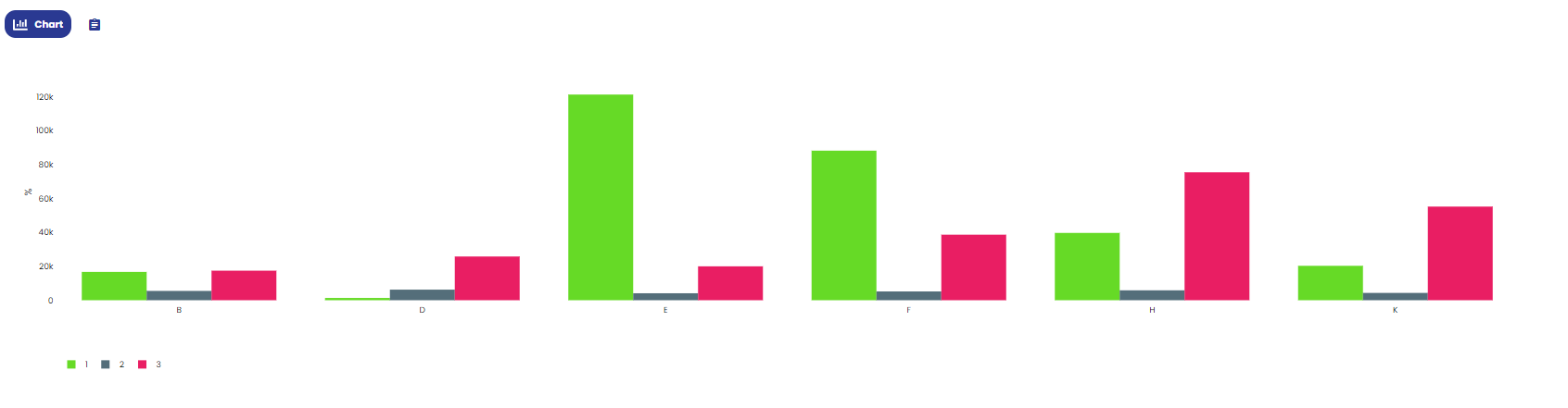
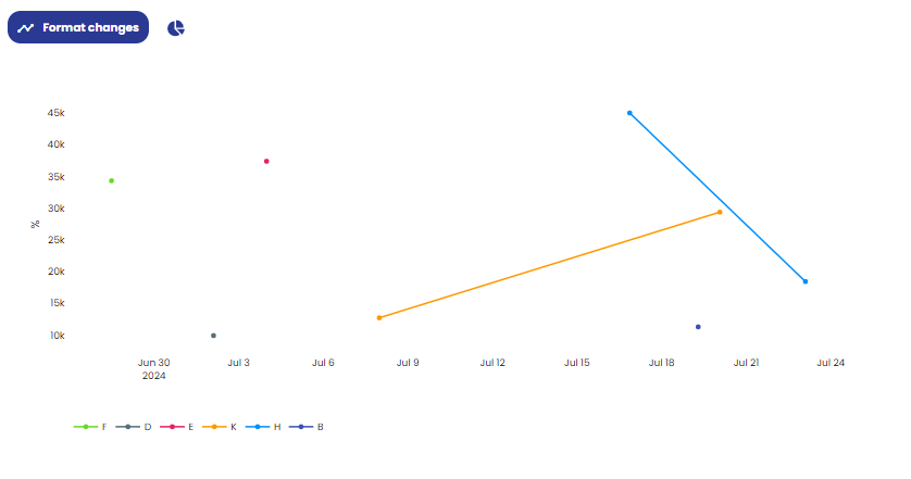
The central part of the page consists of various types of charts:
bar chart: this chart shows the cumulative value of the selected KPI for each possible type of format change that can be made with the selected initial and final formats. The x-axis displays the initial formats, paired with the final format, while the y-axis shows the values of the selected KPI. If all phases are selected, the analysis will be divided by phase, but all phases will be displayed in the chart. Alternatively, by choosing a single phase, each format change will be associated with the bar for that phase. The data in this chart can also be viewed in tabular format by switching the display mode via the appropriate control;
time scatter plot: this allows you to represent all the format changes of the selected type that occurred within the specified time interval. The x-axis shows time, while the y-axis shows the value of the selected KPI. Each point represents a format change that occurred over time and the value of the KPI for that specific change. By changing the display mode via the appropriate control, a pie chart is displayed, showing how the time spent on all format changes of the specified types is divided among the various phases as a whole. Note that, by selecting a single phase, the chart will entirely refer to that phase;
Pareto chart: this chart represents a Pareto of alarms that occurred during the specified format changes.
