
Creation of Modules and Pages

To get started, you can create a module using the Add Module button, which creates a module initially containing a single page (Image A). In the window that opens (Image B), you can enter:
the module name;
the icon to associate;
the permission required to view it.
Once the changes are confirmed, the module will be saved and added to the structure.

To add a new page to an existing module, simply right-click on the module name and select the add option. In the page configuration window, you can specify (Image C):
page title;
icon to use;
permissions required for viewing.

It is recommended to define the page permissions using the formatmat-{word1}-{word2}.
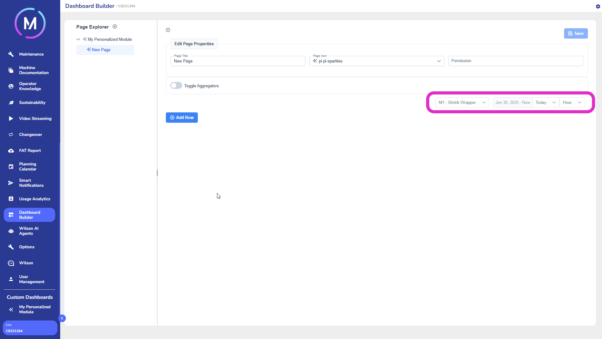
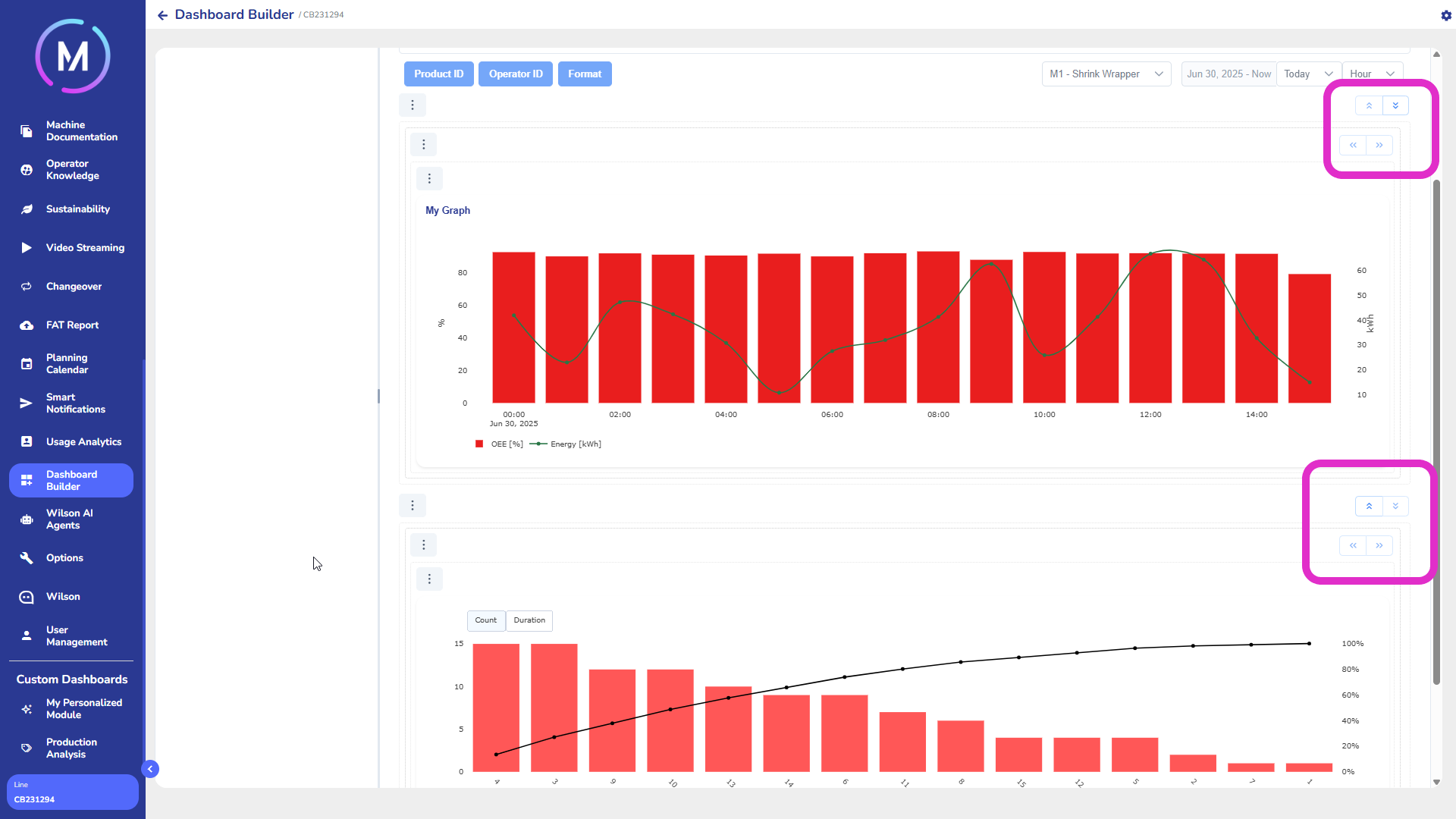
The page header can be customized. Each page, by default, features some useful tools for data filtering (Image D):
sub-machine drop-down: visible only in multi-machine projects, allows selecting the entity to analyze;
time interval selector: defines the reference period for the displayed data;
aggregation selector: allows choosing the temporal granularity (e.g., day, week, month).
The Toggle Aggregator selector allows enabling or disabling the selectors for filtering by aggregator (Image E).

The page can be populated by adding rows. Each row can contain one or more widgets, which are graphical elements that represent the data.

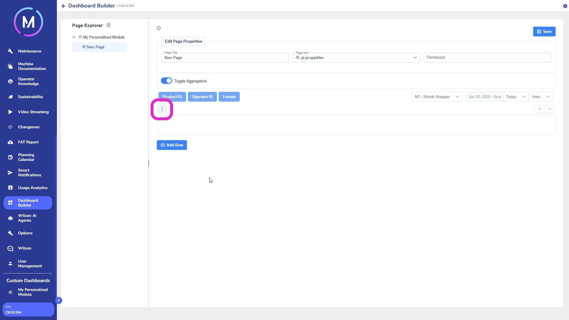
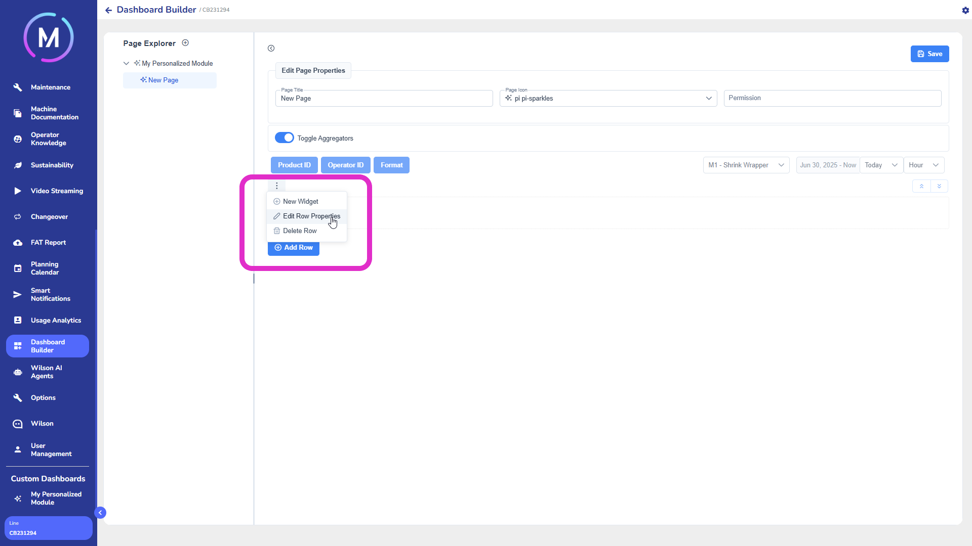
By clicking Add Row, a new empty row is added (Image F). Each row has an icon with three dots, from which you can (Image G):
modify the row properties via Edit Properties (Image H);
add a new widget with New Widget (Image H).
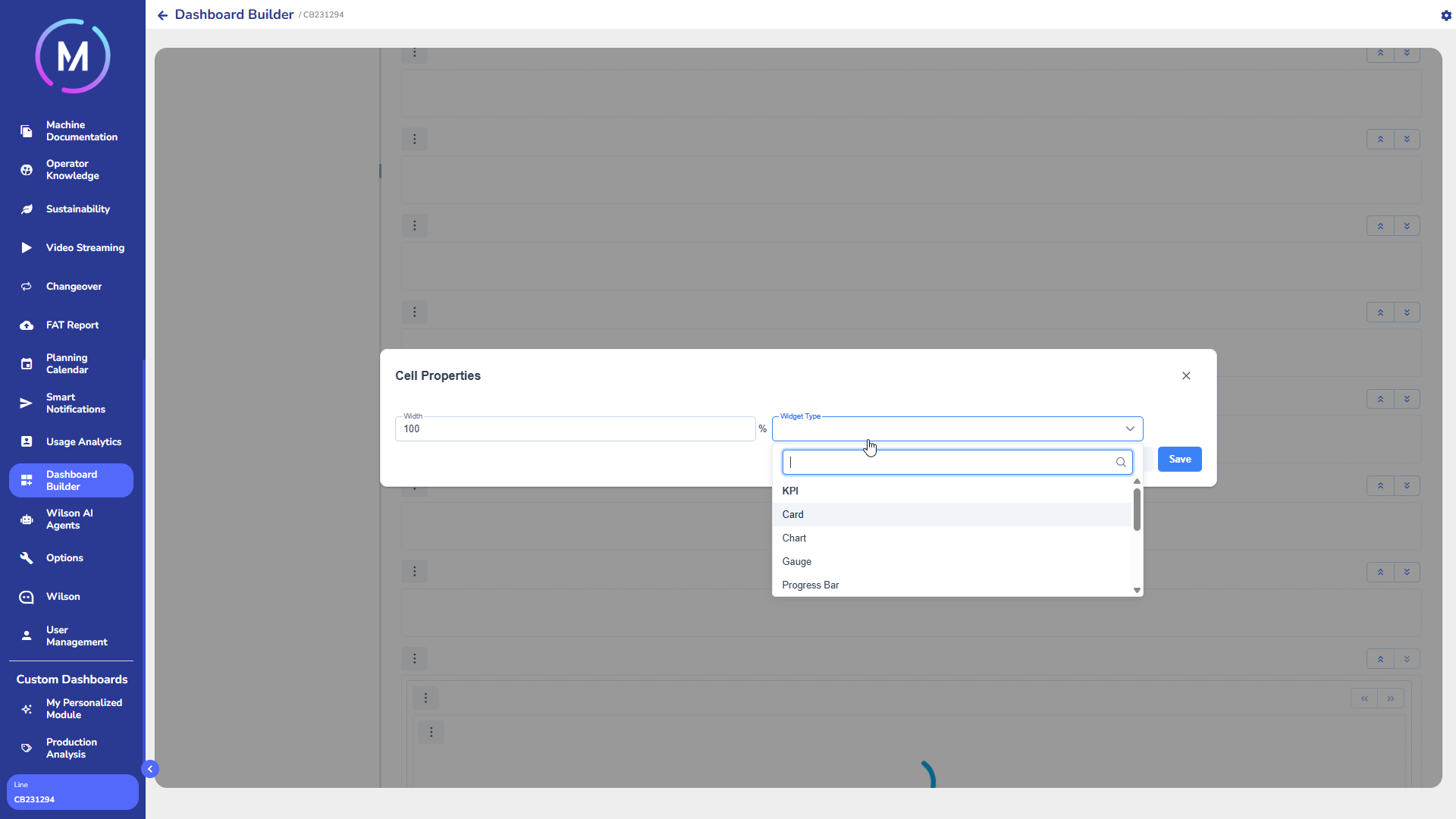
Modifying the row properties means defining its size and gap. This can be done via the dedicated window (Image I). By changing the width of the row, more cells can be created, each of which can contain different widgets that will appear side by side. The total size of the cells, when summed, must cover 100% of the row.

When adding a widget, you can choose its type from the drop-down menu (e.g., chart, table, KPI, etc.) (Image L).
Each type of widget has specific properties depending on the selected type. For a detailed description of each widget type and its related options, please refer to the dedicated documentation.
When there are multiple widgets on the same page, arrows will appear next to each one, allowing you to change the order of the widgets on the page to reorganize their position (Image M).
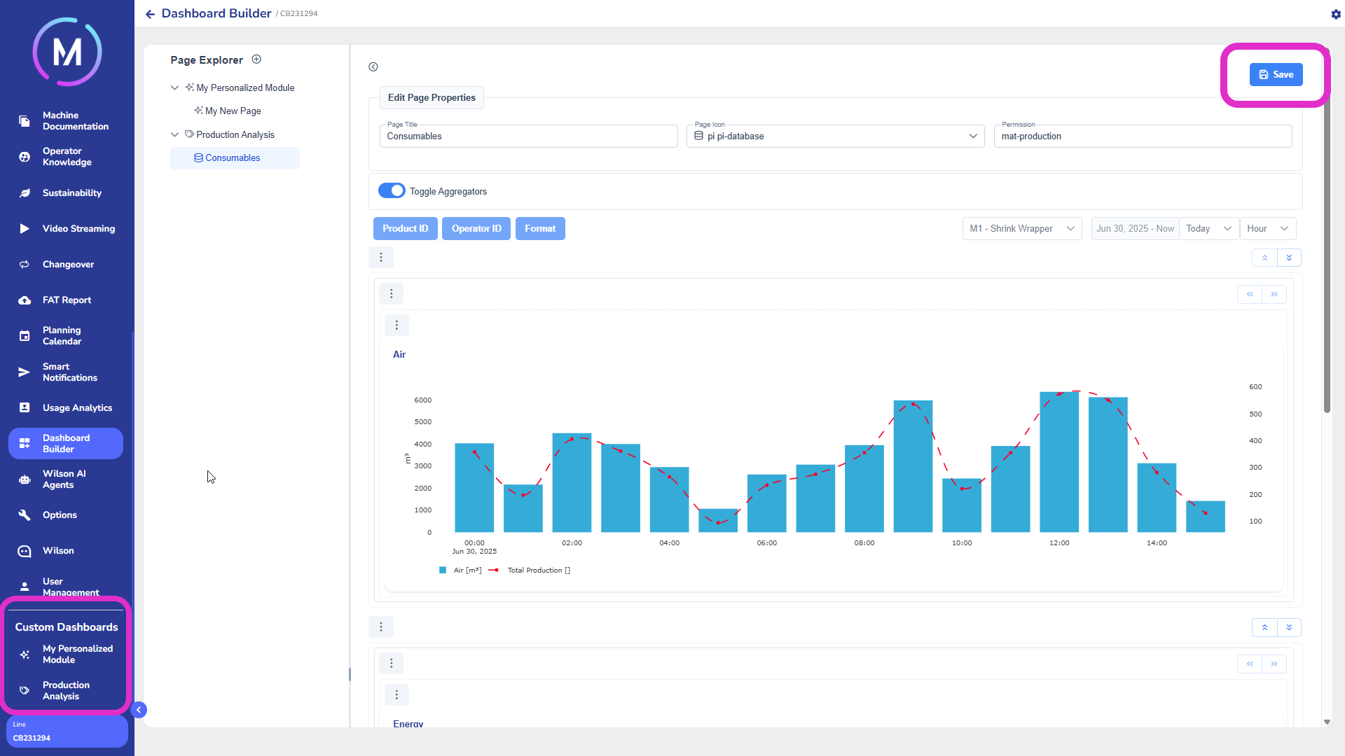
Once the configuration is complete, you must click the Save button to save all changes. After saving, all the modules and dashboards created by the user will be displayed in the custom dashboards section of the main menu (Image N).
To delete a page or a module, right-click on the corresponding name and select the delete option. Note that deleting a module will also delete all the pages it contains (Image O).